RE-AWAKEN A BRAND
In response to a brief I had to awaken a brand through a theme of Connection. The 'brief' was set my a publishing company to promote a book series how ever we see fit as long we stick to the theme.
I chose to work with A Song of Ice and Fire written by George RR Martin. The first book covers were design in 1996 and current TV series is quite popular. I chose to connect the books to the new TV series through a VIP Pack, which comprised of all the books with modern covers, a sophisticated display box as well as collectors cards.
I chose to work with A Song of Ice and Fire written by George RR Martin. The first book covers were design in 1996 and current TV series is quite popular. I chose to connect the books to the new TV series through a VIP Pack, which comprised of all the books with modern covers, a sophisticated display box as well as collectors cards.
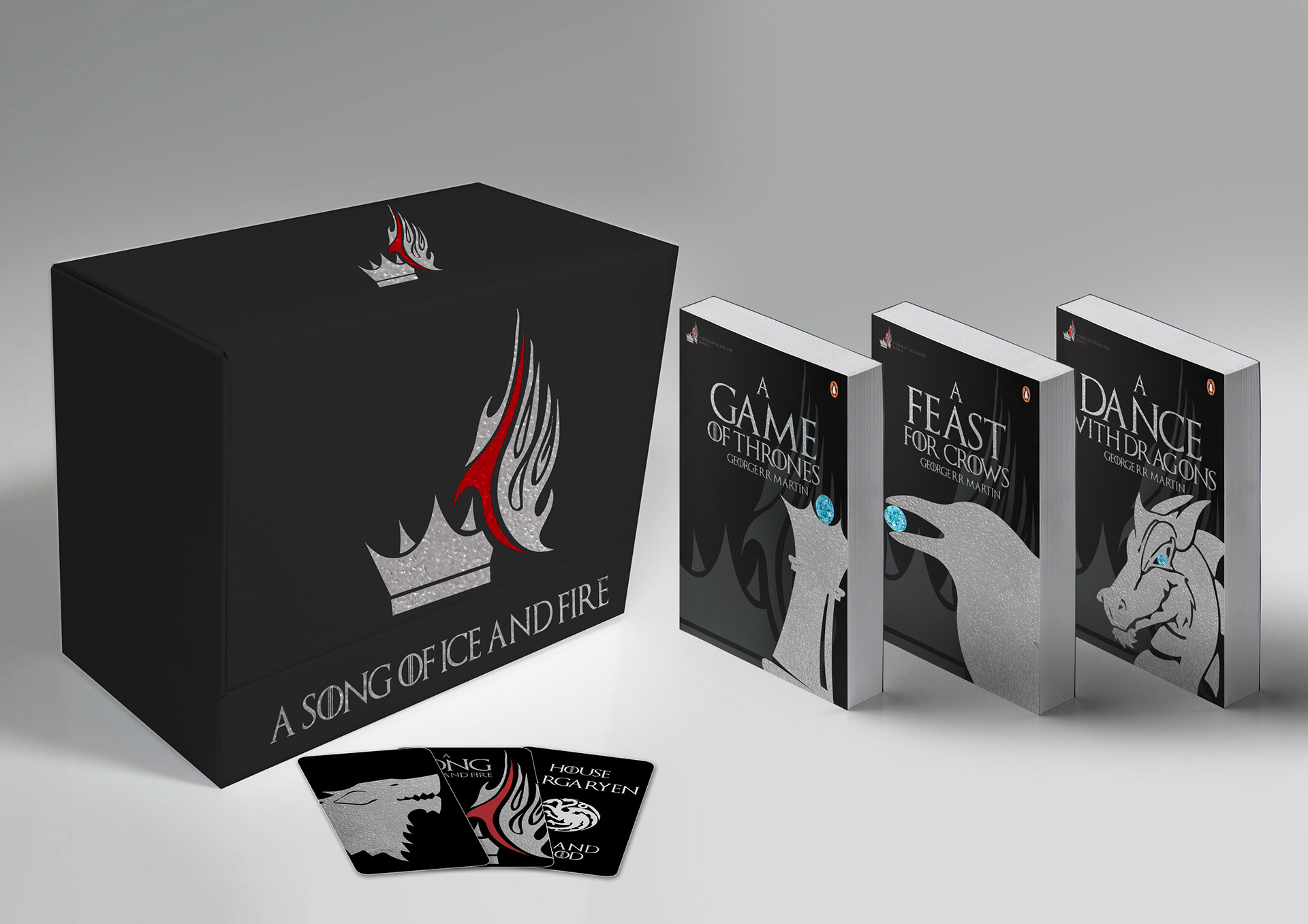
I chose to go with a matt black package to give it a curious feel, and then use heat embossed silver elements to give it the sophisticated feel of a VIP pack. The covers I chose to connect to the title and the TV Series. The blue gem features on the covers as the blue eye from the Ice King. The watermarked logo and centered title remains consistent throughout the designs to show a connection between the books. The Ice and Fire logo features on all the elements to show that it is part of a pack. The collectors cards are printed using the lenticular method. This allowed me to use more than one image on the front of the card. In one view we have the house sigil, in the other view we have the Ice and Fire logo and on the back we have the name of the house and their slogan.
I created a unique logo for the Ice and Fire. The ice is represented by the Crown and the Fire a symbolic flame. I added some red to contrast against the blue gem.
** this is not an actual industry brief - this is in response to a project while studying my BA (hons)**
I created a unique logo for the Ice and Fire. The ice is represented by the Crown and the Fire a symbolic flame. I added some red to contrast against the blue gem.
** this is not an actual industry brief - this is in response to a project while studying my BA (hons)**